2021 PROJECTS: MY BEST ILLUSTRATIONS
DRAWING AND GRAPHIC CREATION PROJECTS
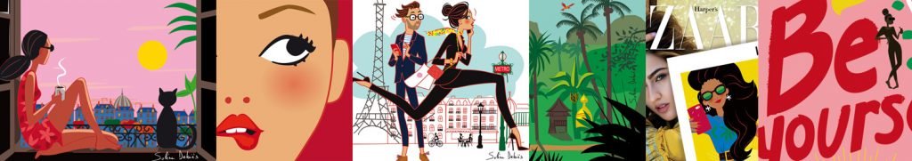
Not all of my illustration or graphic design projects made in 2021 were featured in my blog portfolios or articles.
At the dawn of a new year, here is a brief retrospective of the orders I created in 2021. I have brought together a selection of illustrations or drawings created for clients in the fields of magazine press, advertising, packaging or publishing.
For those of you who wish to follow all my creations more regularly, you’re very welcome to follow my illustrator artist account on Instagram.
In this article, you will discover the imagery, going beyond the pencil stroke, I will briefly tell you about the issues and the progress of the projects for those who are interested (many freelance illustrators or Art students who are interested in the profession frequently ask me questions on these topics!)
THE ANIMATED FILM FOR THE 30TH ANNIVERSARY FOR THE OF DIM BRAND POCKETS COLLECTION
I designed and produced the illustrations for the packaging of DIM's pockets in 2020.
There were 4 covers each corresponding to a pocket woman: The adventurer, the city dweller with a Paris illustration, the festive one and the natural one. Each package contained 3 cute panties.
Last year, the brand wanted to make a short animated film using the illustrations created for the packaging and then posted it on their social networks. Here is the result :

THE POSTER FOR THE "SALES & THE CITY" COMMUNICATION OPERATION FOR THE CITY OF CANNES

The city of Cannes has been commissioning me for several years for an illustration for its annual "Sales & the City" communication campaign.
This operation aims to promote shops in the city center for the winter sales. This operation claims Cannes as being a shopping destination, with all the brands as well as the sun and the sea! This campaign is aimed both at audiences living on the Mediterranean coast and at audiences further afield with poster advertising campaigns deployed as far away as London!
The message sent is clear: In Cannes you can do the sales in peace, just next to the water's edge, under the mild winter sun of the Côte d'Azur.
To illustrate this point, I imagined and drew 3 characters that I’ve been drawing for several years now, who I evolve from year to year: 1 man and 2 women do their shopping in the city's high streets, with the Croisette in the background.
This year, due to covid, our 3 serial shoppers are masked, but still in their assertive and colorful style! The campaign was broadcast on urban posters such as “Decaux lollipops” and on the façade of the Palais des Festivals.
THE BOOK COVER FOR "THE EXTRAORDINARY LOVE LIFE OF THE BEARDED WOMAN"

For this project, I was contacted directly by the author, François Légende.
Having learned about the subject of his book, I obviously wanted to draw its cover! Everyone has already heard the stories of the bearded woman, but François Légende had the audacity to take an interest in her love life...
Which sounded like a good idea to me!
Using a pink background, and Adobe Illustrator software to do my vector illustration, I was able to rejuvenate the iconography of the bearded woman, who is generally represented either in engravings or in black and white photography.
VISUALS FOR STICKERS FOR LANCÔME US
I’ve been collaborating with the Lancôme brand in the USA for a few years. II created the packaging illustrations for the "beauty boxes", in collaboration with their designer.
This time the team contacted me to ask me if I could come up with and create a whole series of visuals intended to be printed on stickers.
The objective of this operation was to create and distribute these colorful stickers to New York office teams (marketing, communication, finance, etc.) so that they could personalize and style their office equipment (Mugs, computers , folders, etc.) with these images that underline the values of the brand. Some examples above!

THE ILLUSTRATED FRENCH WINE MAP POSTER

This is a personal design project that finally found its way into my shop and is now in high demand!
I really like wine and I’m interested in its history, how it’s produced, its terroirs… So I looked for a poster of French wines for my kitchen to help find my way around the different designations.
I found a lot of wine lists, but they were generally quite dull and with a very technical and masculine approach, as often in the iconographies that revolve around wine.
Some were more decorative and a little lighter in their graphic design - they could have gone in my kitchen! - but they were not at all precise as a source of oenological information...
So I took out my pencils and my graphic palette, I got all the “A.O.P” designation information from the INAO, and I created this tailor-made wine list! Of course, it’s for sale for all those who wish to decorate their kitchen, their cellar or their wine press with a beautiful, colorful and stylized wine list from France!
In the shop, you will also find posters for living rooms, bedrooms and even bathrooms, there is something for everyone, and they are all printed individually on very high quality art paper!
AND THE VISUAL FOR THE POSTER OF THE CELLAR NETWORK "LES DOMAINES QUI MONTENT"
I’m taking advantage of this wine-related aside to show you the poster produced for the gourmet cellars and grocery stores “Les Domaines qui Montent”.
I designed the visual of this poster for the communication operation that the "cellar and delicatessen" network is launching for the Spring Wine Fair. It highlights their offer of producer wines at attractive prices.
In my illustration, we’re off on a journey, with a couple on a motorbike driving through the countryside towards a small village that smells of the land. Once there, they’re bound to taste an excellent local wine.
This poster inspired me, because I personally like:
- Riding a motorbike in the countryside
- Good wine!
The 2 obviously don't go together - at least not at the same time - except in an illustration!

THE COVER ILLUSTRATION AND INTERIOR VISUALS OF THE 2022 HOROSCOPE SPECIAL FROM THE VERSION FEMINA MAGAZINE

Finally, on a completely different note, Version Femina magazine contacted me back in spring of 2021 to ask me if I was interested in a project where I would need to create the entire 2022 Astro special issue.
What I like about horoscopes is that you can totally let go in terms of creativity! I had already made illustrations for horoscopes (ELLE India and Marie-Claire in particular) but I had never drawn all the illustrations for a magazine, and that’s including the cover and the full deck of Tarot de Marseille!
Do you like the result?


You may like the illustrations portfolio: